


Maureen Stone is an authority on color and an expert on data visualization. She’s the author of A Field Guide to Digital Color, and she’s the director of research at Tableau, where she also serves as unofficial color honcho for the popular data-visualization tool.
So how, exactly, did I end up talking with her about animal attacks?
It’s relevant to how our eyes separate visual information.
“Lightness and motion go to different parts of the brain, because, in the real world, you need shape and motion,” Stone explained to me. “If a tiger jumps at you, you run immediately. Once you’re safe, you can figure out whether it was a tiger or leopard or black panther.”
Indeed, all of Stone’s tangents during our chat had the same basic subtext: She understands color and human visual perception on a deeply fundamental, even biological, level. That’s why we went to her for some pointers on how to use color effectively (and responsibly) when creating data visualizations — which continue to have their moment.
Here’s Stone’s advice on how to balance context, accessibility, aesthetics and intuitiveness when making color choices for your data visualizations.
3 Tips for Using Color Effectively in Visualizations
- Get it right in black and white. This makes your visualizations more accessible, but contrast signals importance even when you add in color.
- Be literal. If people already associate what you’re illustrating with specific colors — political parties with blue and red for example — it’s best not to break with those expectations.
- Keep it accessible. Orange-blue scales are the safest option to serve users with color vision deficiency. But you can still use other colors if you’re smart about contrast.
‘Get It Right in Black and White’
This handy mnemonic, popular among designers, is something of a mantra for Stone. “Get it right in black and white” means that all the information contained in a visualization, all the differentiation represented by the various colors and values, should still be present even if you stripped the map, graph or plot of color, turning it grayscale.
Stone pointed to this NPR map from August, which illustrates which states make their COVID-19 contact-tracing data public.
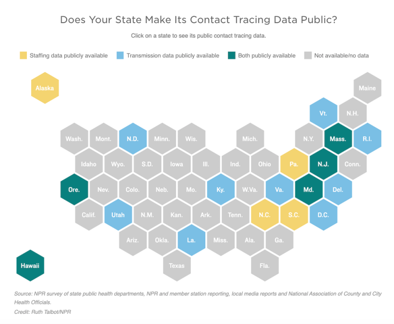
As the legend shows, yellow states share so-called staffing data, and blue states share transmission data. Green states make data from both sources available, and gray states share no data.
Which of the four colors pops most? The green, which is substantially darker than its neighbors. But the pop comes less from the green hue and more from its dark shade. Even if you stripped the chroma of the full map down to grayscale, the green would still be the standout element, Stone said. In short, lightness and contrast are more important than color.
In the NPR map, green represents the most transparent states, in terms of contract tracing data — the most notable among the four options, if you will. So it ought to be the most eye-catching. “That was a pretty good design choice,” Stone said.
And which pops least? The gray — or the least notable, in terms of data transparency. “The gray is great for ‘no available data.’ That speaks well cognitively as well as perceptually. It kind of sits back.” (Stone offered one constructive criticism: The blue pops out over the yellow — and does so in grayscale too — which could imply a hierarchy between the two that might not be intended.)
Stone stressed the same point in a January webinar about how to use color thoughtfully in data visualizations. She spotlighted the National Park Service map below as a successful example. Notice how, even with the color stripped, the contrast communicates the different categories of information. The parkland, the water, the non-park interior and the roadways each remain reasonably distinct in grayscale.
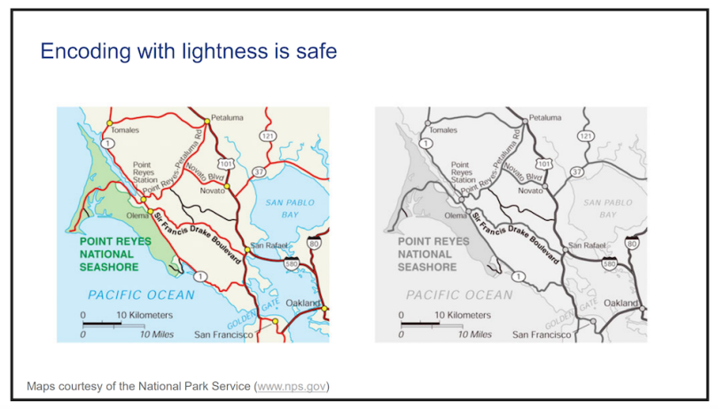
“It’s easier to read the one on the left, but the one on the right works,” Stone said.
“The most basic thing is to remember that the color is secondary,” she added. “You need to think about what’s important to see.”
Be Literal-Minded
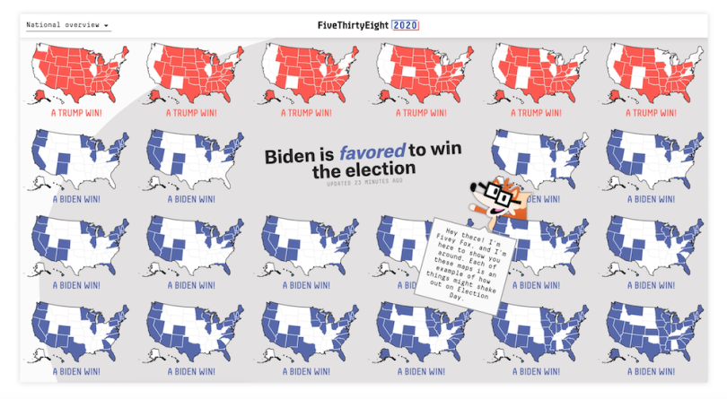
Both of the above maps contain examples of another Stone dataviz-color best practice — what’s known as semantic resonance. That’s just a vaguely academic way of saying that the relationship between colors and the information they represent should be intuitive. For example, political maps should have literally red and blue states, counties, districts, etc. Speaking of which, Stone counts FiveThirtyEight’s 2020 election model design as a recent standout visualization package.
The semantic resonance is perhaps more obvious in the National Park Service map. It could hardly be more literal: green for the grassy, protected coastline; light blue for the ocean and bay; and (mostly) black for the roadways.
In the NPR map, it’s as simple as the fact that green communicates positivity. Think of our green associations: health, freshness, fertility, progress (as in green means go). Still, Stone included an instructive caveat: “Green is good — in Western cultures at least.” In other words, stay forever mindful of your audience demographics.
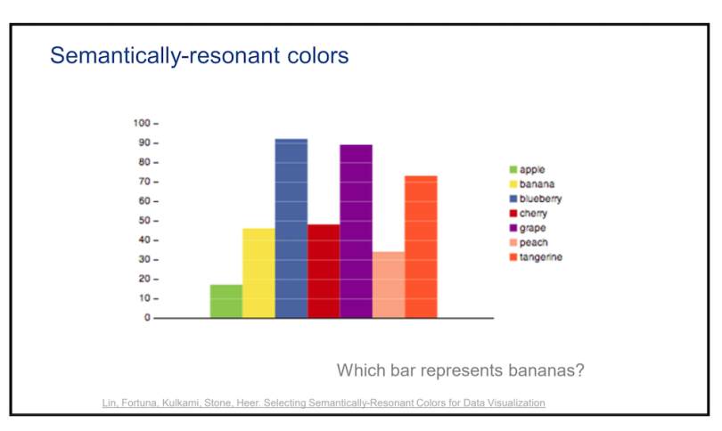
Stone drives the point home with a chart she created of hypothetical fruit sales, with yellow for bananas, blue for blueberries, red for cherries, etc.:
Contrast that with arbitrarily chosen colors on the map below — the visual equivalent to nails on a chalkboard, with a car alarm blaring in the background:
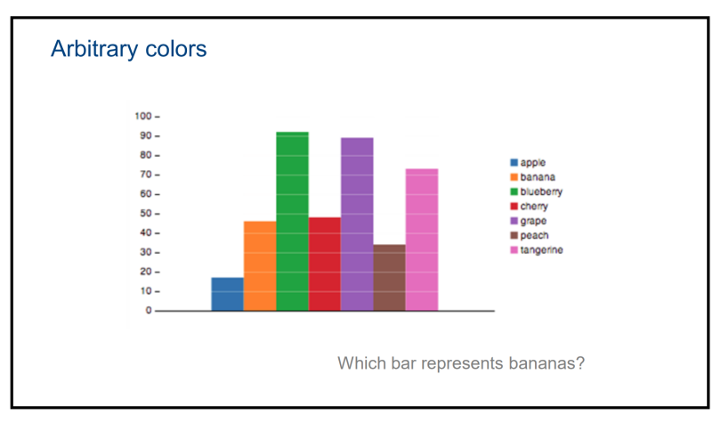
Few data sets lend themselves that seamlessly to semantic resonance, of course, but it’s something that should nevertheless be kept front of mind, Stone said.
For visualizations that are less categorical or descriptive, and more outwardly quantitative — like choropleth maps — Stone points to tools like ColorBrewer. That application incorporates a well-defined gradient scale that keeps scales intuitive. It won’t inherently prevent catastrophes like the Georgia Department of Health’s much-dragged (but since-improved) choropleth map of COVID-19 cases, but it’ll help solve the most fundamental color legibility hurdle.
Keep It Accessible
Some of these concepts also feed directly into what should be a paramount dataviz-color consideration: making sure visualizations are legible to people with color vision deficiency (CVD).
The most common form of CVD is red-green deficiency. There are four types of red-green deficiency, which range in severity. A good way to help accommodate the full spectrum is to circle back to the grayscale rule. Making sure that information and scale come through via the contrast of color shades — with the color hue itself being a secondary consideration — also ensures that people with CVD can use the visualization as effectively as those without.
This is also why designers don’t necessarily have to avoid using red and green together, as long as they’re diligent about responsible shading.
“Luminance contrast manages attention even more than color,” Stone emphasized.
Maureen Stone’s Rules for Accessibility:
- Maintain contrast for legibility
- Never use color alone for critical encoding
- Blue-orange-gray are your “safest” colors
- Get it right in black and white”
- Use a color-vision-deficiency simulator
There are a host of online tools available to keep visualizations CVD-friendly. Stone highlighted the color contrast analyzer by accessibility advocates The Paciello Group. You can also use simulators that cast your visualization in shades that people with color weakness and blindness would see. Notable simulators include Colorblindly, Coblis and NoCoffee. Stone pointed to color-blindness.com, which also includes a CVD simulator, as a good reference.
In Tableau, you can avoid potential mishaps by sticking closely with a blue-and-orange scheme — the default option and “by far the most colorblind safe.”
That said, there are many times when context binds visualization builders’ hands. To circle back to politics, “anything about the U.S. election had better be red and blue,” Stone said.
The aforementioned FiveThirtyEight-model visualizations incorporate a bit of light purple, to communicate some uncertainty between the red and blue poles. That’s a sensible choice given the context, even though purple can sometimes be difficult to distinguish from blue for people with some forms of CVD. (Again, paying attention to shading — as FiveThirtyEight appears to have done here — helps alleviate these concerns too.)

If you want to be extra mindful, however, add some second or third encoding element beyond color, Stone advised. The image below shows what she means. Notice how the added “X” provides a failsafe for “red = null.”

“If it’s absolutely critical, don’t encode it with color alone,” Stone said.


