With client work spanning industries as diverse as freight tech, fashion and auto parts, creative outfit Rainfall has made its capabilities known to companies in a variety of fields. But one notable recent project led to working with an entity that couldn’t be more familiar to the Seattle-based agency: Rainfall itself.
Earlier this year, the design firm embarked upon a nuts-and-bolts creative rebrand with an aim to imbue “more of a personality” into the company, according to CEO and Chief Creative Marc Anderson.
“The tendency for a lot of agencies — and certainly this was true of us — is to let our own personality take a back seat to the work that we create,” Anderson said. “And that is important; we survive and thrive off of the work that we do for our clients. But over time, we noticed that our own voice was getting lost. We wanted to have a bolder personality and a real confidence that could be expressed through this identity, about the work that we create and our professional capabilities as an agency.”
To jumpstart the process, Anderson and Rainfall COO Samantha Kawabata wrote a brief that served as a creative and strategic compass to guide the broader efforts of product designers Summer Li and Mike Patruno. Li and Patruno worked independently in two week-long design sprints before getting together to discuss their efforts; along the way, Anderson provided feedback and other creative contributions as needed to further steer the project to its desired endpoint.
“On a visual level, we wanted to achieve something modern and contemporary speaking to our current design vernacular, but also something very ownable and recognizable as Rainfall itself,” Li said. “So for someone out in the world looking at this new identity, they should immediately be able to recognize that this is coming from one place — Rainfall.”
Ultimately, the team hopes that the recently launched rebrand serves to cast a wider net in terms of potential clientele while ushering in a new creative chapter.
“In a post-rebrand world, we want to see the different types of clients that we’re trying to attract, but also the different ways that these clients interact with us when compared to the past. That’s our benchmark for success,” Patruno said.
But it’s not just external wins to be had. Anderson is also excited about the internal ones already reaped from this work. “We created an opportunity for individual exploration. That’s really the most challenging thing in identity work: trying to give everyone the opportunity to explore and then at the end of the day selecting a final vision. I felt like it was a pretty successful process at the end,” he said.
The team peeled back what it was like to direct their critical and creative attention inward in a conversation with Built In, along with the lessons they gleaned from doing so.
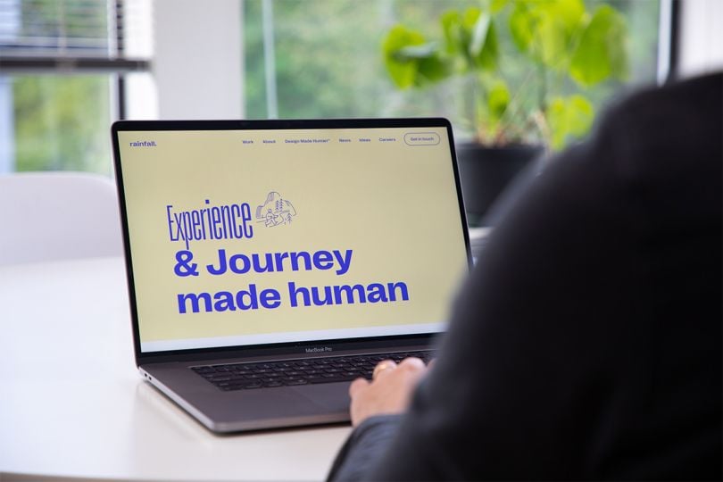
First, let’s talk about your philosophy, “design made human.” What does that mean?
Anderson: The idea is to uncover who the core audiences are that are going to be interacting with whatever it is that we create — whether that’s a website, a product or, in this specific case, our identity — and then how that identity actually manifests itself across different touch points.
Patruno: We really put a lot of effort into seeing things from the perspective of our clients and their users. It’s not only about ensuring this is represented in the solution we deliver, but also making sure we’re really thinking about these two parties throughout the process of working with clients.
Li: What’s really unique about our approach is being able to see users as well as the client that we’re working for. Oftentimes, I feel that users are the people who a lot of agencies or products focus on, but the clients are coming to us with a business need. That’s important to how we’re delivering our products and our approach.
What are some of your favorite elements of the rebrand?
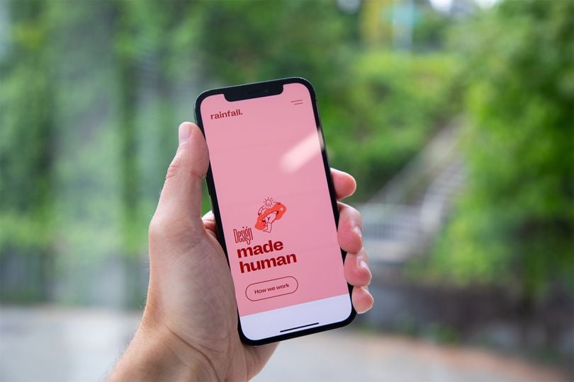
Anderson: I’m really excited about how we’re using modern design elements. For example, we’re using a variable typeface, which is then applied with kinetic type so it comes to life. We’ve created this system that’s essentially animated, but then has moments that we can take and use in static frames. We partnered with an amazing illustrator who has done work that resides in tandem with that typography.
This feels very ownable and unique and will allow us to have more of a day-to-day presence. Certainly across social media, it gives us a framework to basically say whatever it is we want to say — whether it’s in regard to design or we’re marking fun things like National Doughnut Day — in a way that should ultimately be immediately recognizable as associated with Rainfall.
Li: I’m really excited about the way that we’ve treated the typography. We’re essentially using the type as image in a lot of the cases. Marc did a really great job with the way that he treated them. It’s almost like a squish type that’s revealing an image so it acts as this curtain from its initial state. Even though we’re using a typeface, it looks almost like a sketch, which is something that references one of the core concepts we used to develop the identity. We really wanted to embrace, highlight and be unapologetic about our process and approach. That sketchines is a part of this unfinished process that we’re all in when we design. It adds a lot of human touch to the identity and fits with a lot of our core values as an agency.

Patruno: Our use of typography harkens back to some of our other core concepts around more human qualities, like this sketchy type, for instance. Also the way that we are using type and image together, and how they interact, highlight that. It all ties into our new approach and the recentering of our philosophy.
What was it like being the client in this situation?
Patruno: I found it to be a bit challenging. It’s a lot easier to solve other people’s problems than your own. Marc really encouraged us to take the time to take a step back and dive deep into what we’re trying to do as an agency. Going forward, the experience gives me another perspective when we’re working with clients to think really deeply about their business, as well as their end users.
Anderson: That opened us up to a lot of new ideas and challenges that we face as a business that I hadn’t identified, and certainly didn’t have solutions to prior to our conversations. It really reinforced that those activities that we do with clients are important to set the stage for coming up with unique solutions that are actually effective for their business, as opposed to just assumptions made at the outset.
Li: It was really helpful for us to have those types of discussions internally as a team, which I don’t think we’ve done to that extent before — being able to unify ourselves on exactly who we’re talking to and what our approach is. Having started just a year ago, I didn’t necessarily know what those things were. So to be able to align with my coworkers and Marc on that was really helpful.
How did the “design made human” philosophy inform your efforts?
Anderson: As we were creating, a lot of the work was not only asking whether this will interest other designers like us, but also whether it’s accessible to people who aren’t necessarily versed in the field of design, who are just coming to us as the design experts to create solutions. In that regard, really keeping an eye on who those audience members were, and then also our own business needs and goals, was paramount to the entire process.
Patruno: It really helped us take an introspective look at what kind of work we want to do at Rainfall, how we currently serve clients and any opportunities for improvement in those relationships. It was much deeper than just a visual rebrand or redesign. We thought about the fundamentals of our company and tried to identify our place as a business in Seattle, on a global stage and within the larger design community. What are we looking to say as an agency? Who would like to engage and contribute to that?
Li: We did a “design made human” workshop as a team, which was a really great process. We have a template that looks at key audience members who we want to target, which we typically use with clients. Doing this internally, we identified right away the specific audiences that we wanted to talk to through this identity, whether that be other agencies, other designers, prospective clients or potential talent.
What do you ultimately hope to communicate with the rebrand?
Anderson: I hope that it communicates both our level of talent and also our design sophistication. It’s really rooted in core design principles, as opposed to other sorts of visual design that are very of the moment. I want our clients to immediately see the way that we think and approach problem solving. I hope they are able to identify that not only through the work that we create, but also through our brand identity.
Li: I hope that the identity communicates that we really do have a clear point of view. Hopefully that translates to the process that we’ll have with our clients as well, allowing them to trust us in our approaches.
Patruno: I hope that our humanity comes through and that we clearly convey that we’re humans working with other humans. That’s the core of our work.